Explore Data
Overview
Do you want to explore your uploaded data and create a few quick visualisations?
The AgileData App offers a range of inbuilt facilities for easy data exploration.
While there is the option to open the data in Looker Studio, you can also directly explore the data in a visual way with Google Facets Dive which is available from within the AgileData App. This enables you to gain quick insights into the data without having to consult an external tool or create a dashboard.
Google Facets Dive is an open-source tool developed by Google’s People + AI Research (PAIR) team for the exploration and analysis of large-scale, high-dimensional data. It supports the exploration of both numerical and categorical data.
In Google Facets Dive each record gets represented by a dot or a data point. These dots can get used to explore the data visually. You can also create customized data visualisations and charts like scatter plots, histograms and bar charts. A feature called faceting allows you to slice and group data based on different variables to gain further insights.
In this guide you will learn how to quickly visualise your uploaded data directly within the AgileData App.
Steps
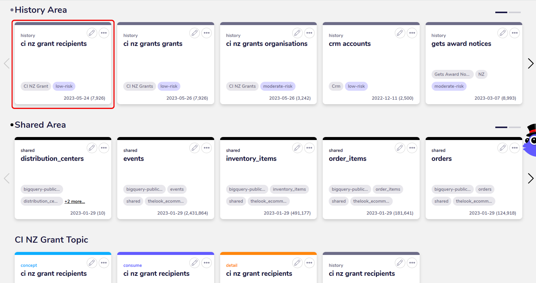
1. Choose tile with data to explore
To begin with the data exploration choose a tile with the data you want to explore.
There are different types of tiles in the AgileData App. History Tiles are immutable records of corporate memory, they provide access to the raw data from the systems of capture and are ideal for data exploration. Consume Tiles have business context added and are ideal for exploring data that matches the business reality.
For our example, we are going to explore a History Tile with data about business grant recipients in New Zealand. The data has been previously uploaded as a CSV file.
2. View information about data in tile
By clicking on the History Tile you can view information about the data for example the trust rules the data needs to adhere to.
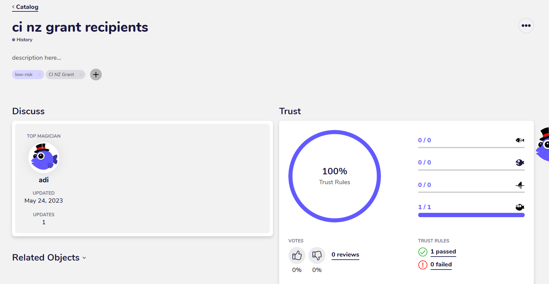
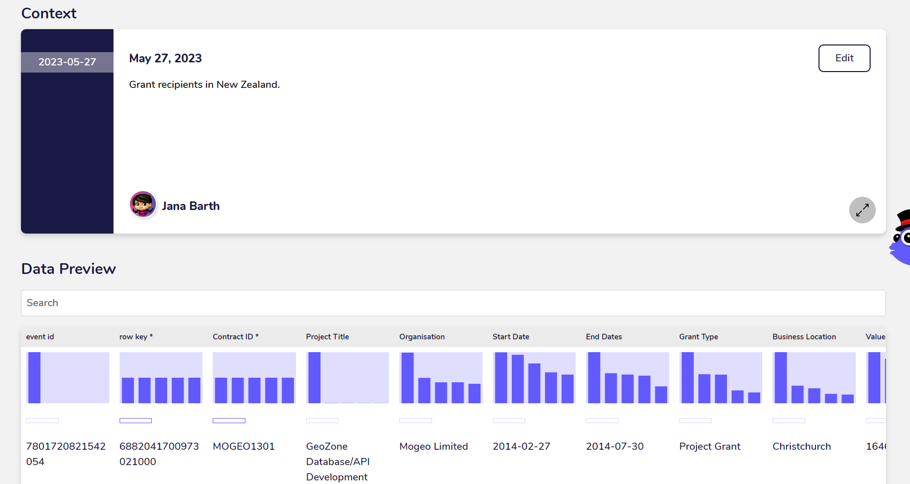
After scrolling down you can view a preview of the fields and the data as well as the overall row and field counts. You can also view the business context, if any has been added within the AgileData App.
3. Explore data with Google Facets Dive
To explore the data in a visual way, you can open it with Google Facets Dive. Click on the three dots in the top right corner of the detail view and select “Explore”.
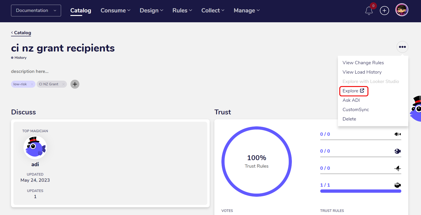
Google Facets Dive will get opened in a seperate tab.
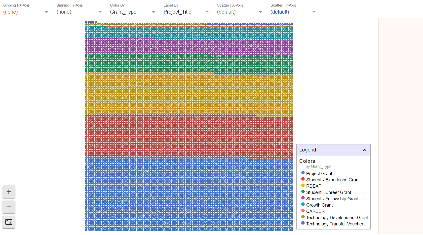
The first view shows all records in the data as singular dots. This means each dot in the visualisation represents one record.
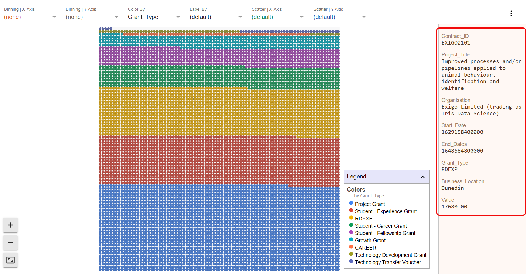
You can view the individual data within the record by clicking on any of the dots. The data will get shown in a seperate area at the right side of the chart.
4. Show distribution across categories
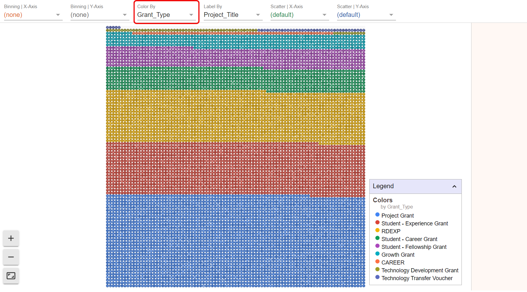
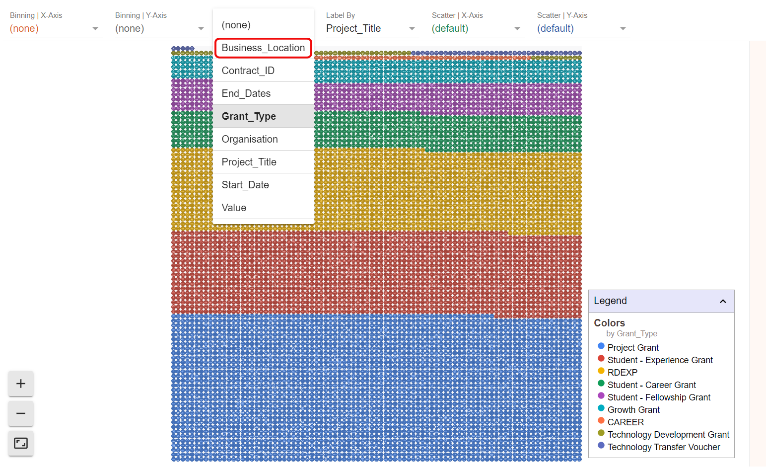
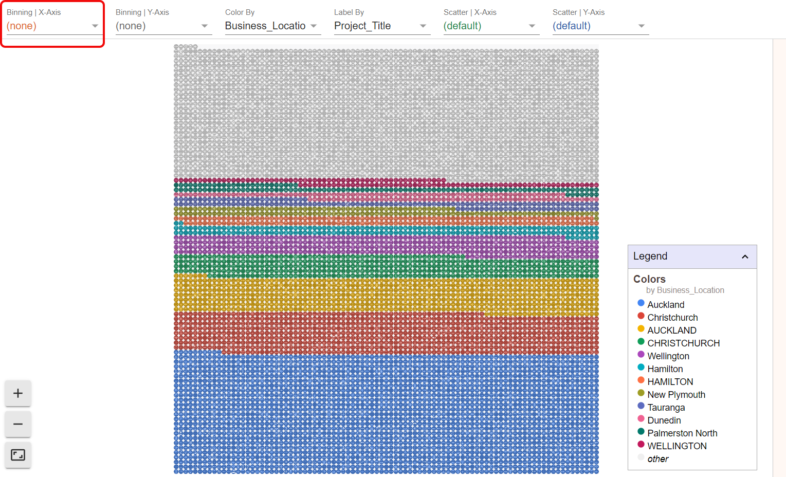
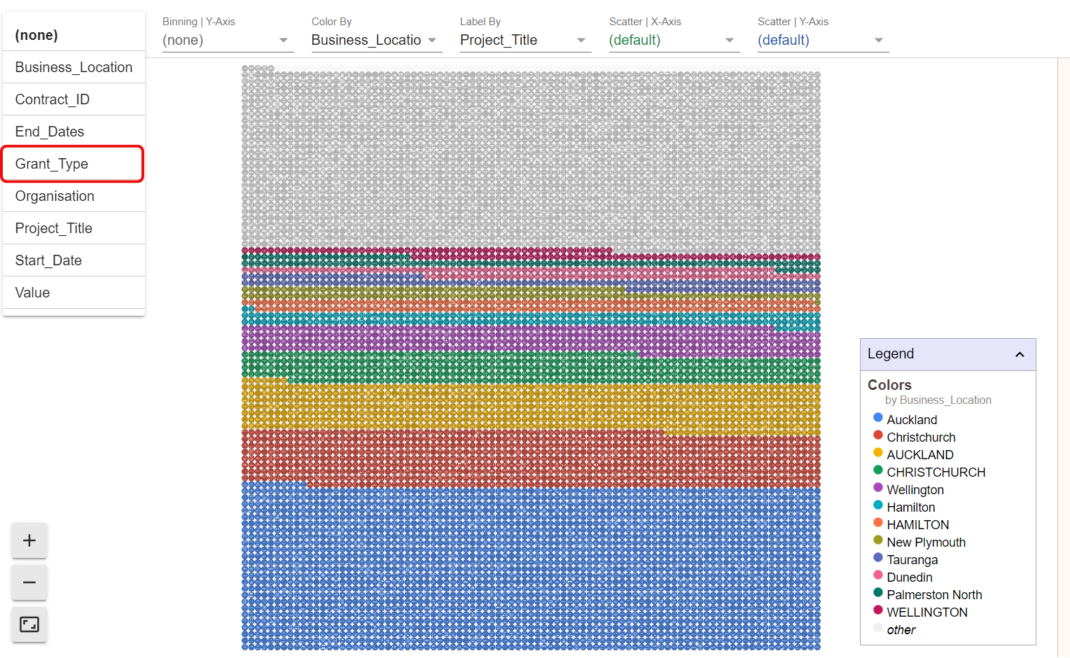
In the first view the records are ordered after grant types, which get represented by different colours in the chart. You can change the variable by which the records get divided by clicking on “Color By” and selecting a different variable.
Click on the variable for which you want to view the distribution, such as business location.
As a result, the records get reordered to fit the new categories. In this visualisation you can for example see that most businesses which received grants in New Zealand are located in Auckland.

5. Break chart up with binning along x- and y-axis
You can break the chart up by binning the dots along the x- or the y-axis or both. This way you can gain a detailed view of the data.
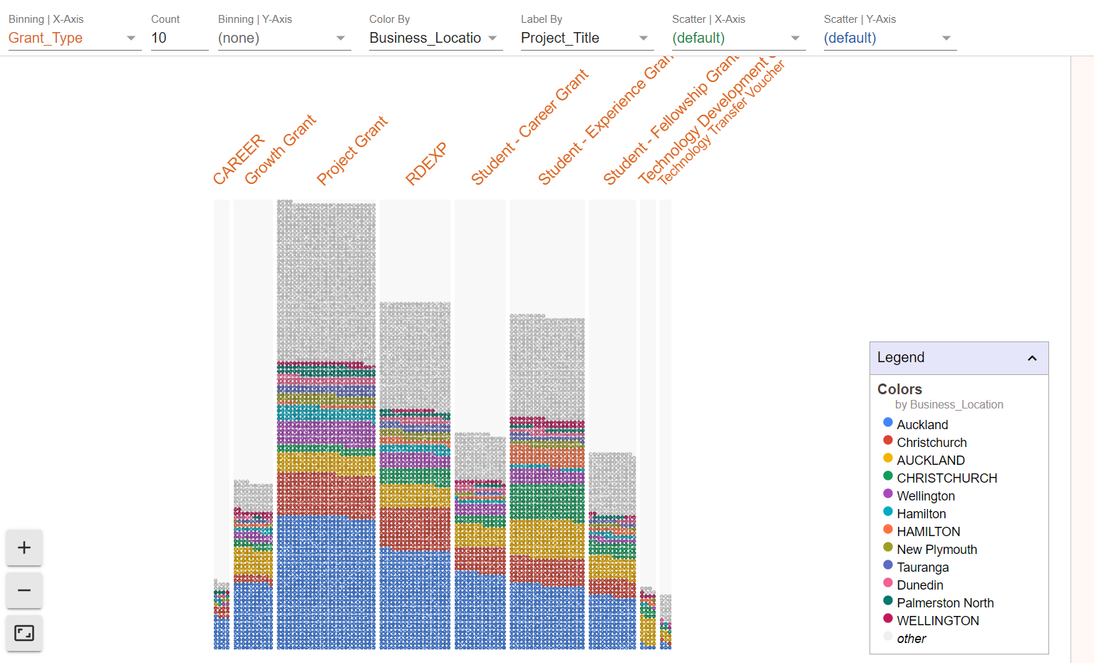
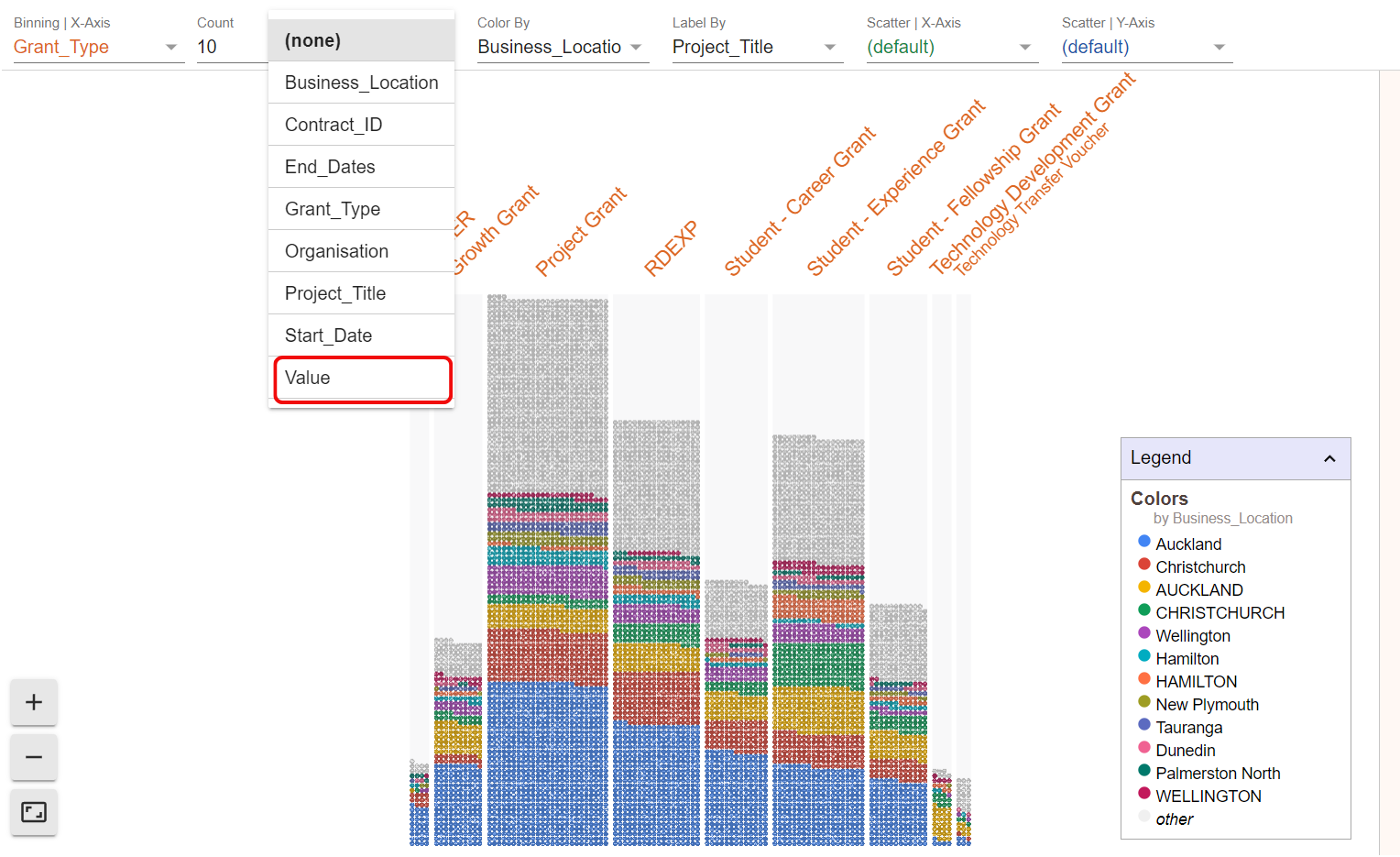
To bin along the x-axis, select “Binning | X-Axis” in the top menu.
Choose a variable among the fields of your data. In our example we are choosing grant type.
The result shows a chart which is broken up along the grant types, but still displays the distribution across the different locations via the colour scheme. This allows us to gain insights into how the locations are distributed for each grant type.
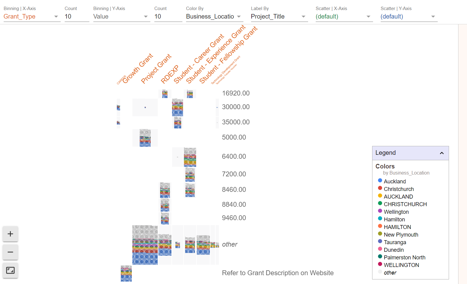
The data can get further binned along the y-axis. Select “Binning | Y-Axis” in the top menu.
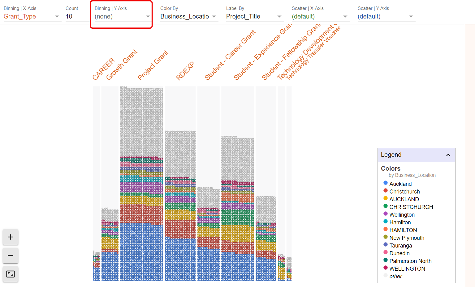
Select another variable to bin the data across the y-axis. In our example we are choosing value of the grant.
The result shows a chart which is further broken up along the different grant values while retaining previous settings for the grant type and business location.
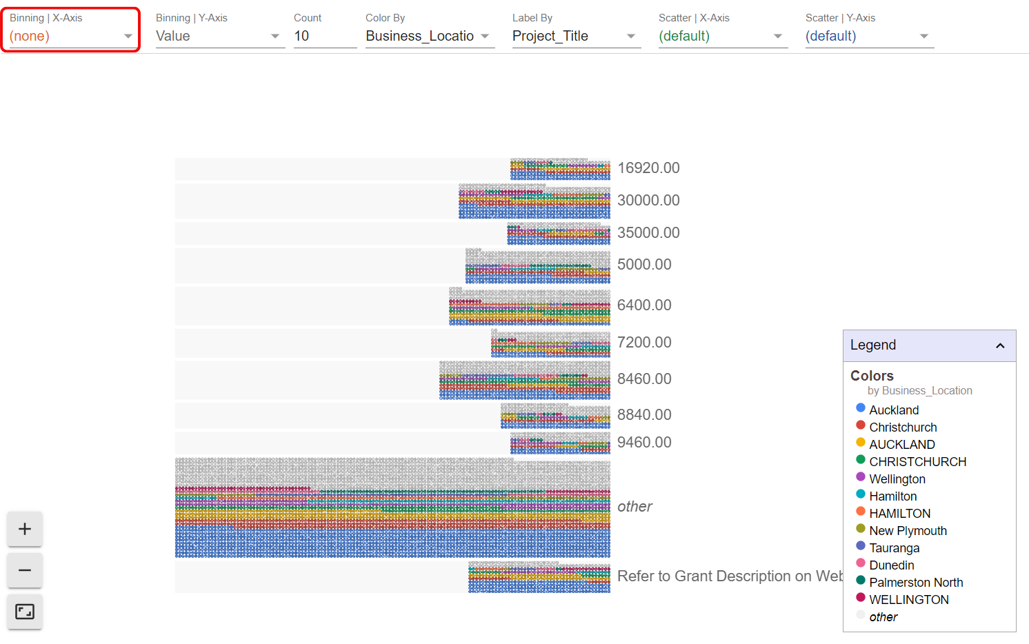
The breaking up can get reversed by deselecting any of the variables in the menu.
There are further options for playing around with the data in Google Facets Dive and creating different visualisations.
All in all this in-built facility in the AgileData App offers a powerful and versatile way to explore freshly uploaded data before creating rules or cleaning it up.