Catalog - Tile Detail - Data Preview
Overview
Do you want to quickly preview the overall size and shape of your data?
In the AgileData App, your data gets automagically profiled within the tiles themselves. By clicking on any tile and scrolling down to the preview section in the tile detail, you can already get a solid overview of the data and its shape without even having to load it in a data reporting platform like Looker Studio.
With the data preview feature, you can explore basic metrics like row count, field count, distribution and null values. This shortens the time you need to invest in data exploration, enabling you to directly start with data reporting and data visualization using the reporting tool of your choice.
Steps
1. Choose the data you want to preview
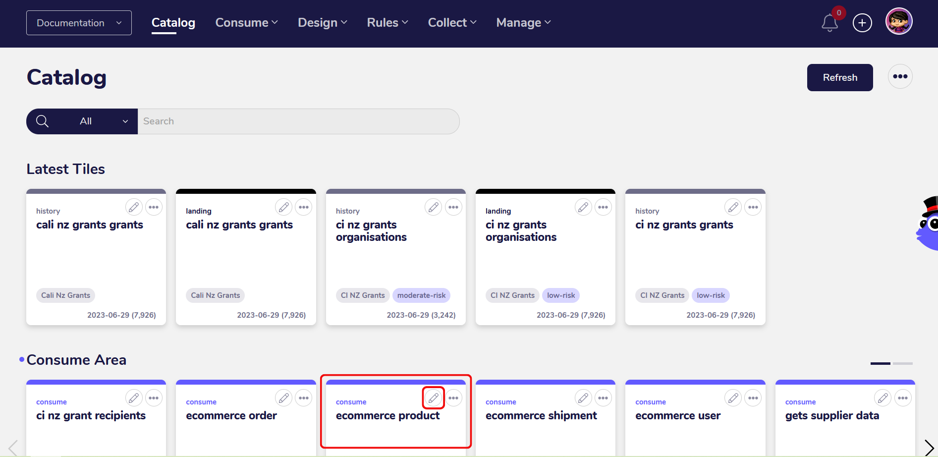
You can access the data preview feature from catalog in the AgileData App.
To view a tiles details and see the data preview, click on the pencil icon in the top right corner of a tile or just click on the tile itself.
In this guide, we’re going to preview data about e-commerce products that has already been profiled for a consume tile.
After you clicked on the tile, a new screen with the tile details will open. The tile detail page provides further insights into the data in the tile, for example trust rules which have been applied, context about the data and a preview of the data itself.
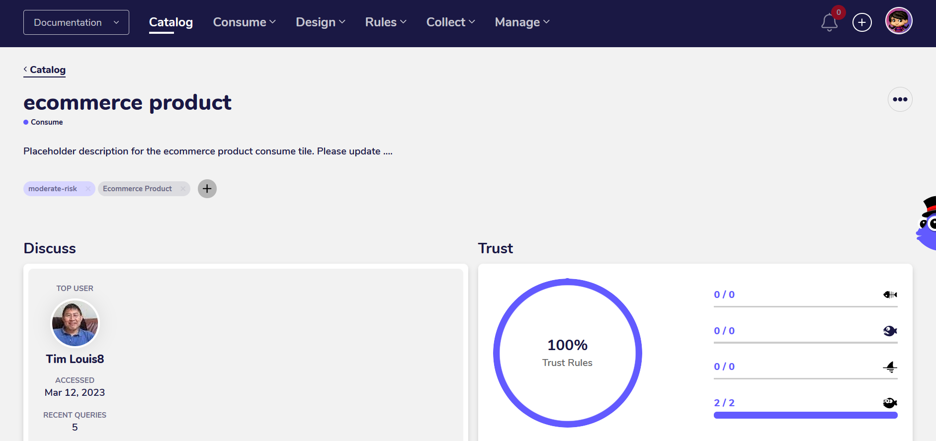
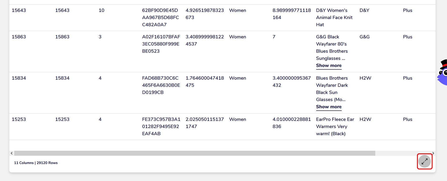
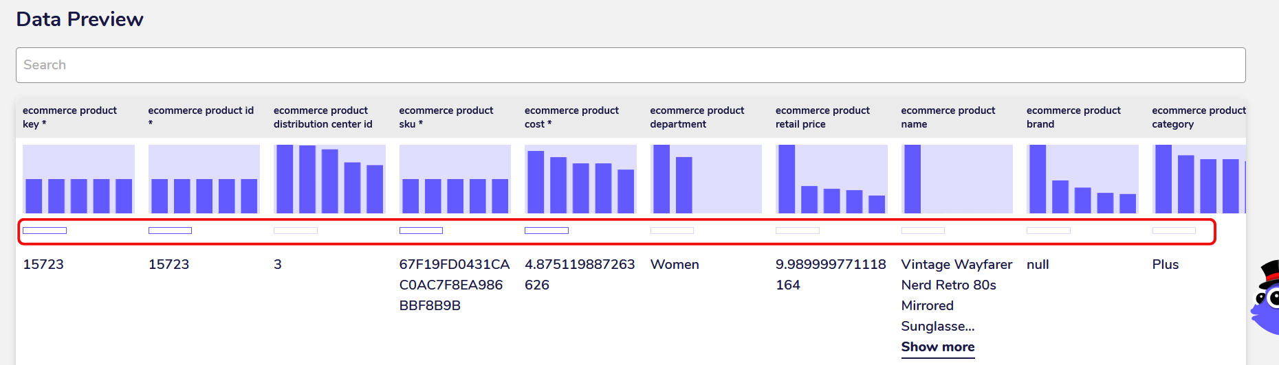
By scrolling down you can reach the data preview section for the tile. The data preview shows the first 10 rows of the data and the respective row values for all fields. Here you can see how much data has been collected, the profile of the data and whether it contains all the expected fields.
2. Preview row and field count
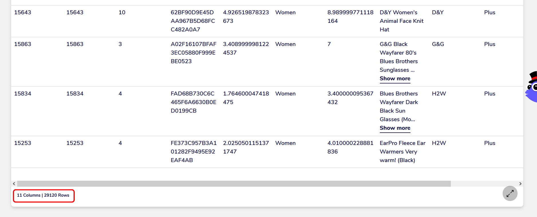
You can preview the overall row and field count by scrolling down to the very bottom of the data preview section. In this case, the tile contains 11 fields and 29120 rows. This feature is useful to get an overview of the overall size of the data.
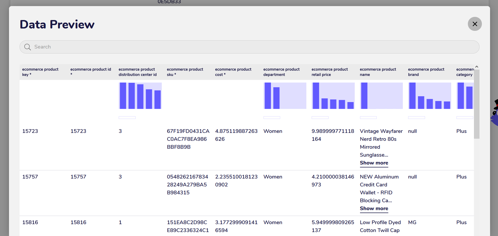
3. Expand the preview section in a separate window
You can expand the data preview section by clicking on the expand icon in the bottom right corner.
The expanded preview section expands ypur view of the data to leverage your entire screen, so you can easily view more fields. Here you can also view the generated charts for the distribution of the values in the fields.
4. Explore the distribution of values in fields
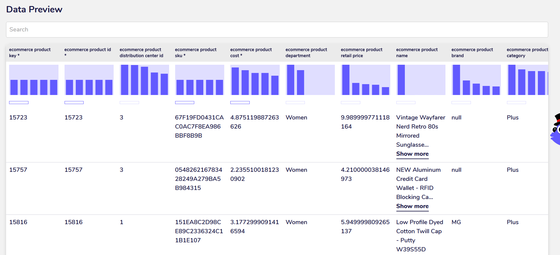
At the top of every field in the preview section, you can view a small chart displaying the distribution of the values. This feature is very useful for quick data exploration or for making decisions about what you can do with the data. Gaining a sense of the distribution of the values is often the very first step you need to take before starting with data analysis or reporting.
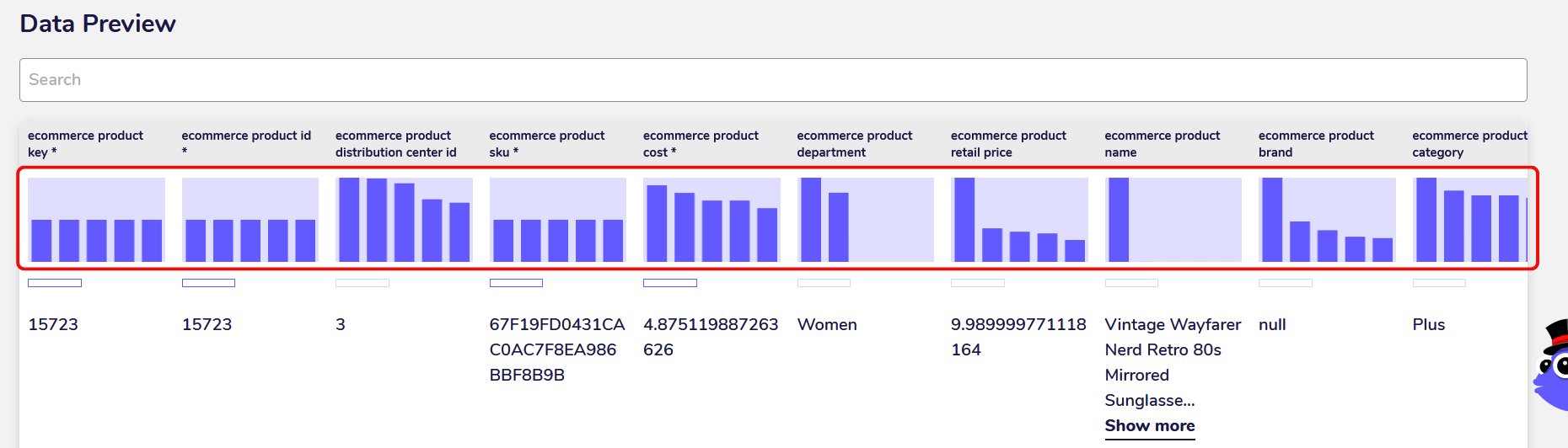
The distribution gets shown as a bar chart with each bar corresponding to a categorical or numerical value. If the field has more than 5 categories or different values, the first 5 with the highest frequency get displayed. You can see the exact frequency of the value by hovering over the bar in the chart. This way you can gain a basic insight into how your data is distributed.
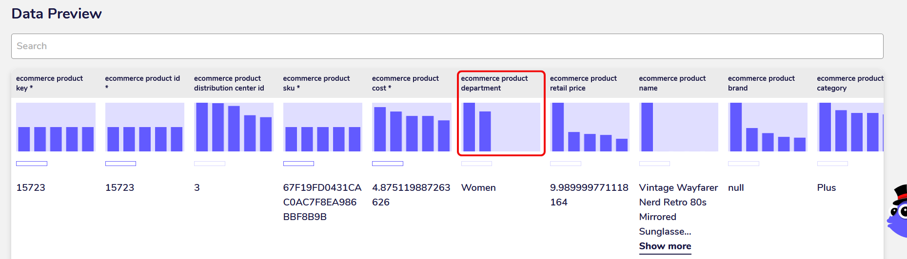
For example, in the tile with the e-commerce product data you can see the distribution of men and women for the product department. By only taking one look at the chart you can already deduce that there are more women than men.
5. View the percentage of null values in fields
Below the distribution charts, you can see a small bar displaying the percentage of null values in the field. You can view the exact percentage value by hovering over the bar. If there is a high percentage of null values the bar will also get shown filled with colour.
Null values are missing, unknown or empty values in your data. Ideally, you should transform your data so that all missing or empty values are encoded as null values, which you can do during data cleaning. Real-world data often contains a lot of missing values as they easily can get accrued during the process of data collection.
The percentage of null values in a field is important to know for making decisions about the usability of your data for data analysis and machine learning. Fields with a high percentage of null values often get dropped during data exploration as the insights you would gain from them wouldn’t be representative of the data.
This is just one way you can use the data preview feature for evaluating your data and making decisions about its further processing.
Use Cases
1. Gain a general overview of your data
The first step in data exploration is usually to get a general overview of your data. Before you even begin with data cleaning, analysis and reporting, you should know how many rows and fields your data contains, how the values in the fields are distributed and whether there are many erroneous or missing values in the fields.
The data preview feature gives you a very quick way of accessing this vital information whenever you require it. There is no need to load the data with a Python library or write any complicated code. If you’re a data analyst or consultant, the AgileData App can make your daily work a lot easier that way by providing a simple interface to profile your data.
2. Make decisions about the usefulness of your data
Not all data can be easily utilised for data reporting, data analysis or machine learning. Data that contains a lot of null values or erroneous values, has a skewed distribution or missing values, often needs to be processed and transformed before you can begin to use it as part of your analysis data work.
The data preview feature lets you gain these insights and make these decisions at one glance. Statistical models, hypothesis tests and machine learning algorithms often only work if your data fulfills certain quality standards such as a normal distribution and no null values.
With the data preview feature, you can quickly decide how useful your data is for what you’d like to do with it and what kind of data cleaning or transformation you still need to do before you can get started.